The brief
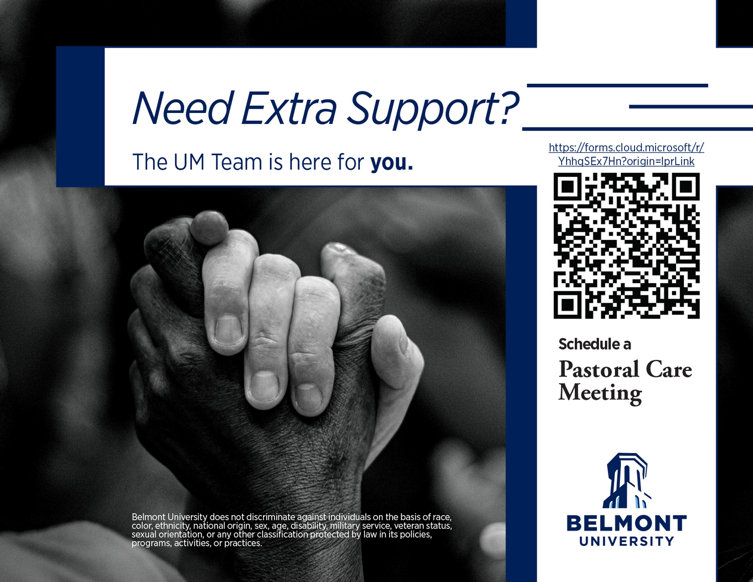
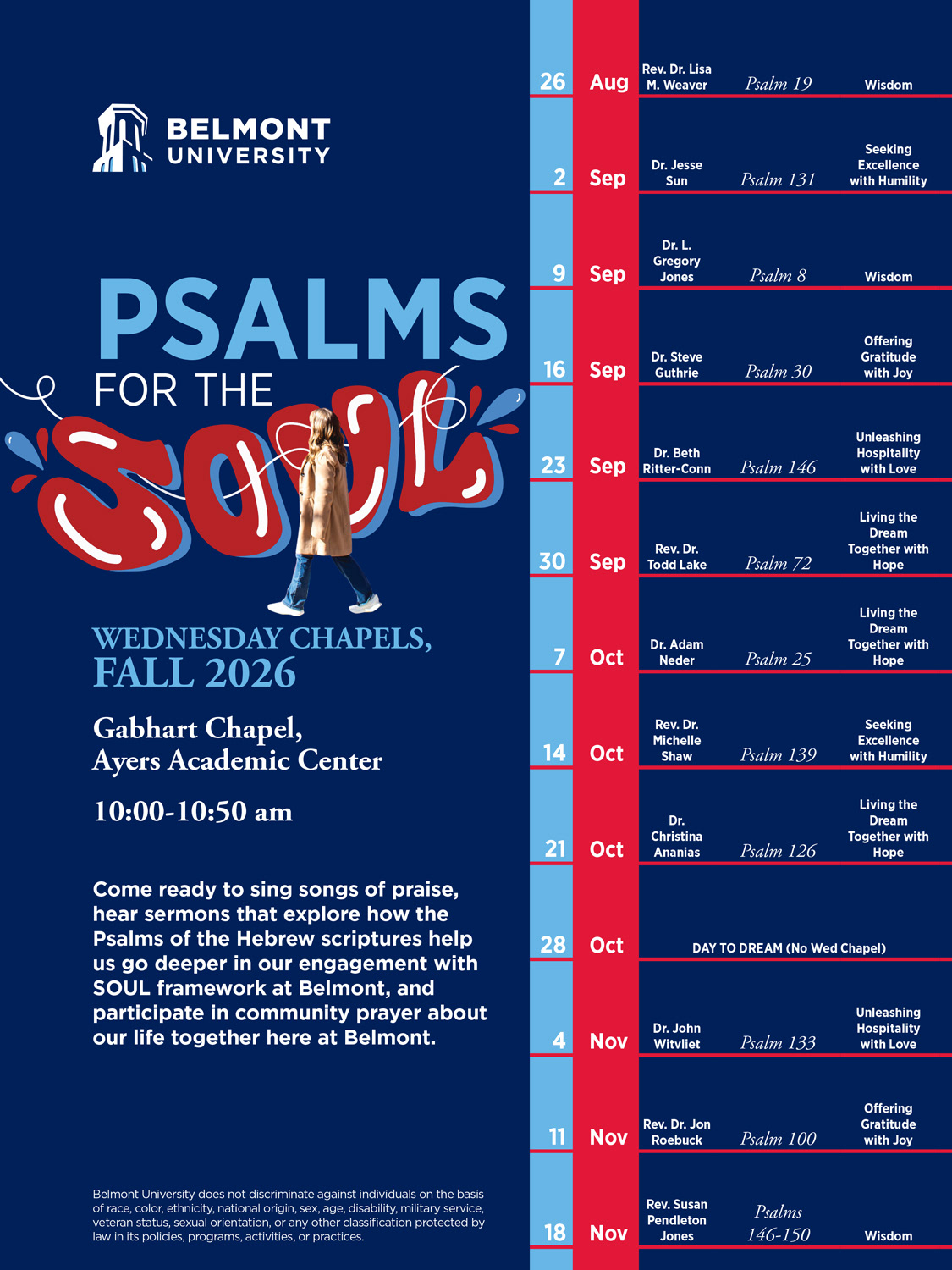
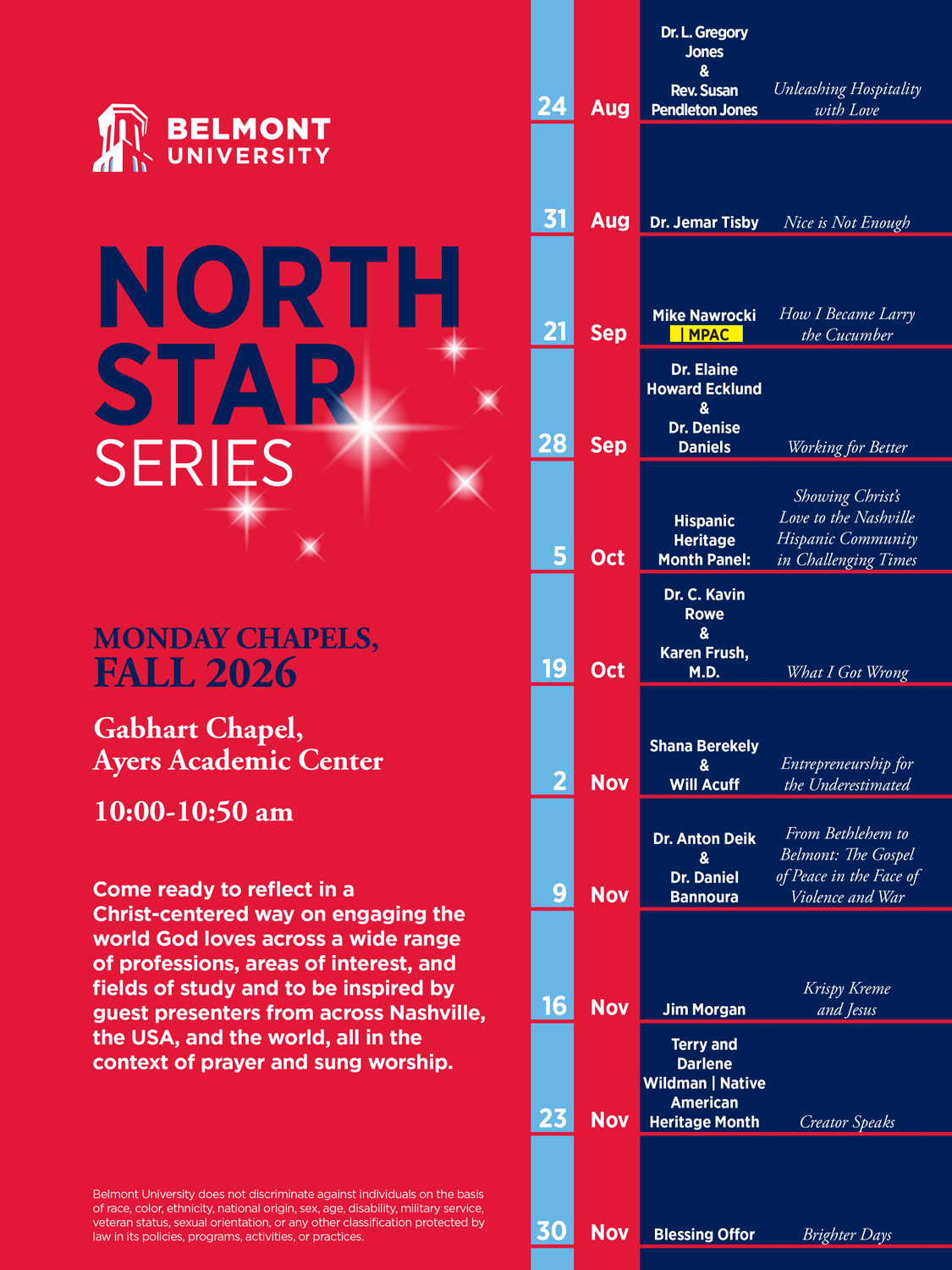
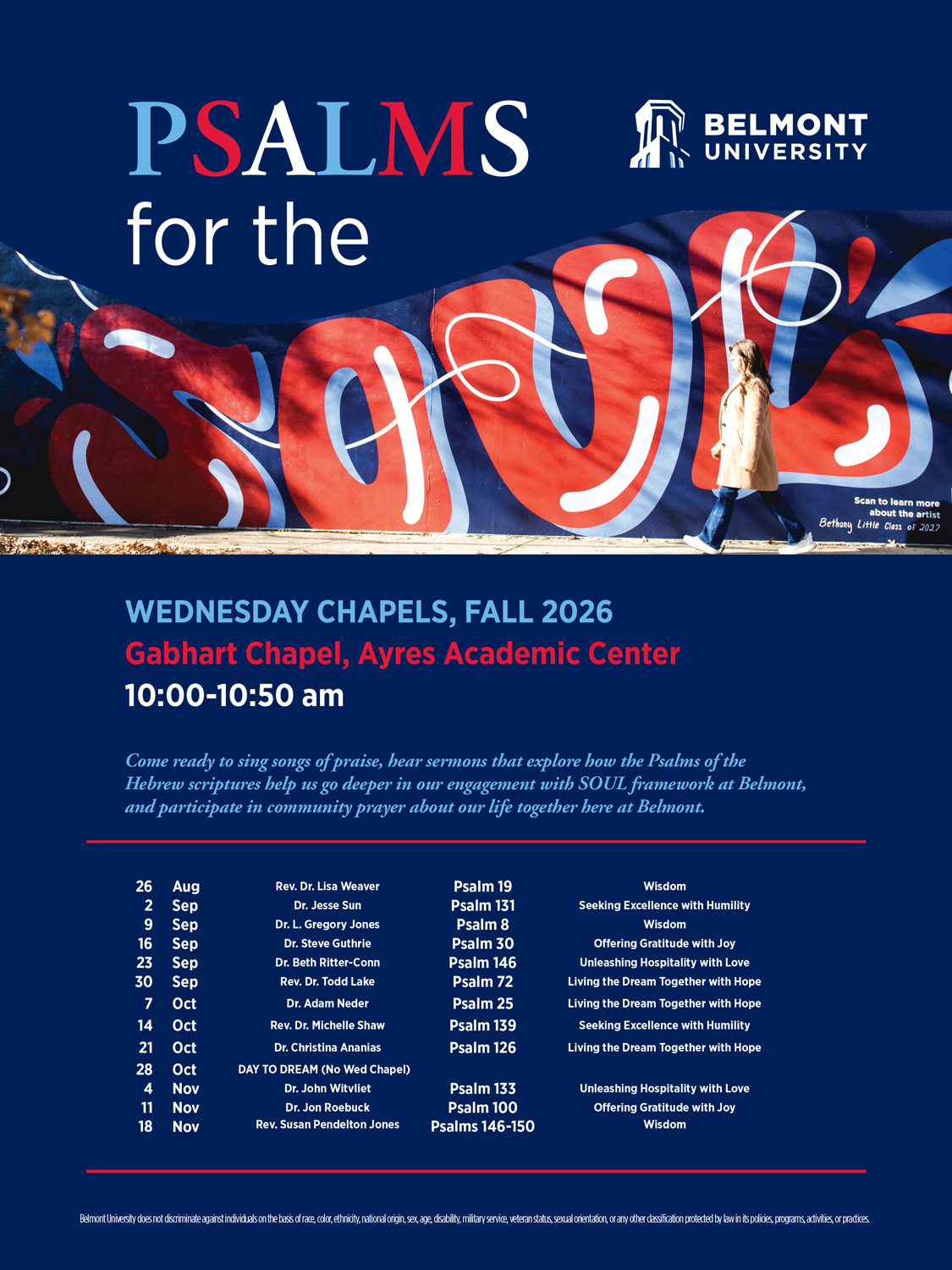
A university needed a cohesive set of posters and flyers for the 2026 school year that spoke to its campus community while staying inside its established brand standards. Each design had to work across several formats: full-size posters, flyers, and display graphics for screens around campus.
Explorations
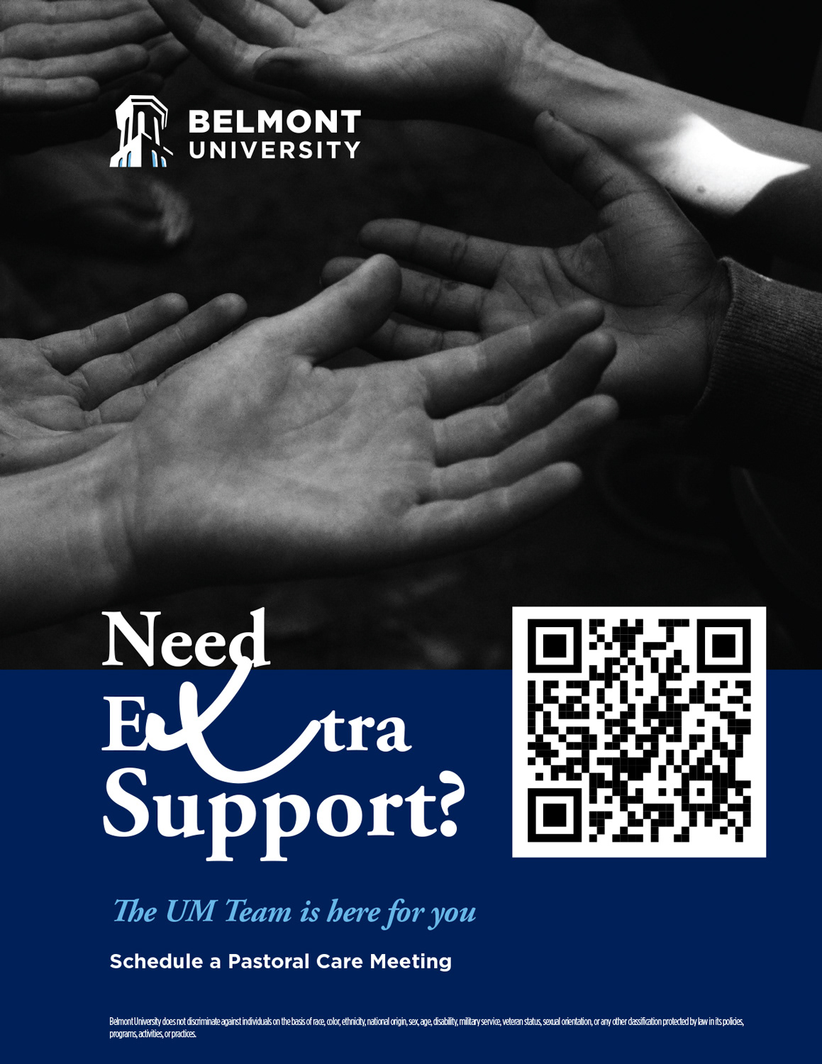
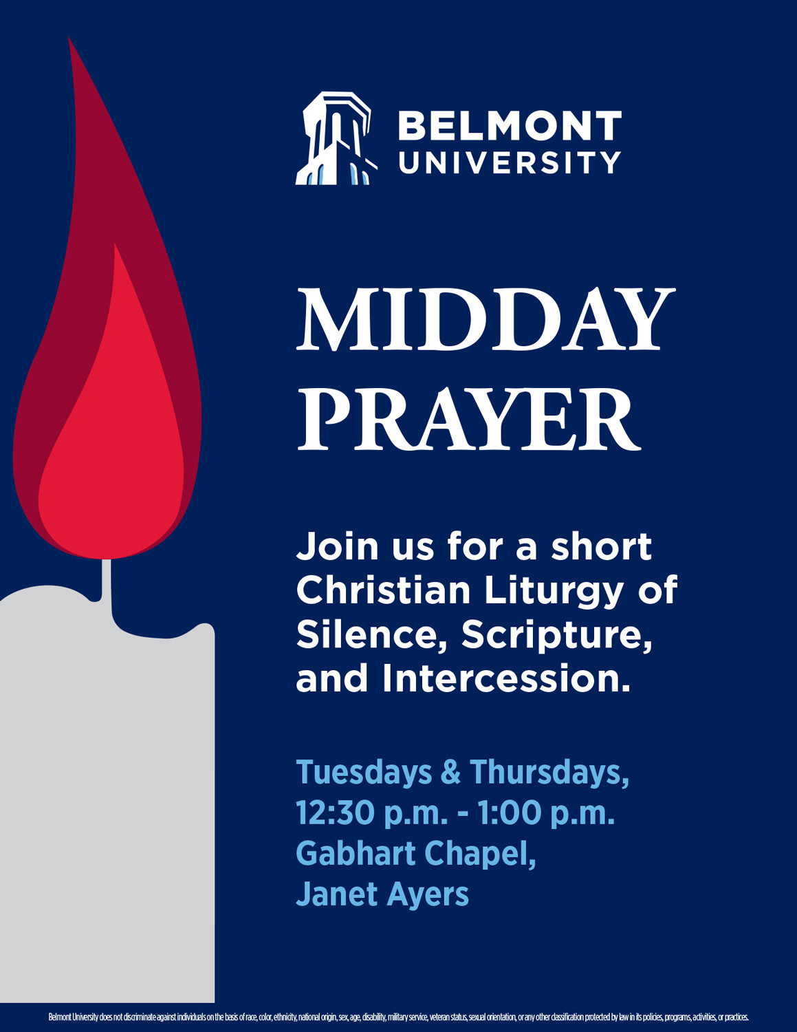
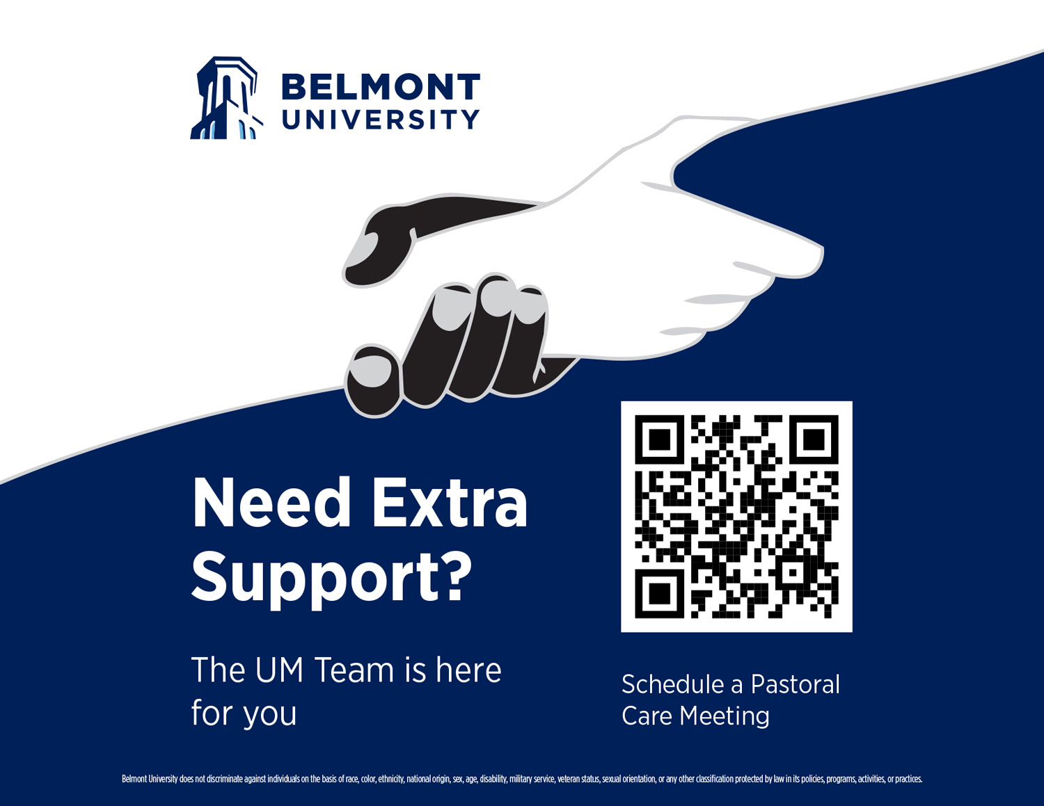
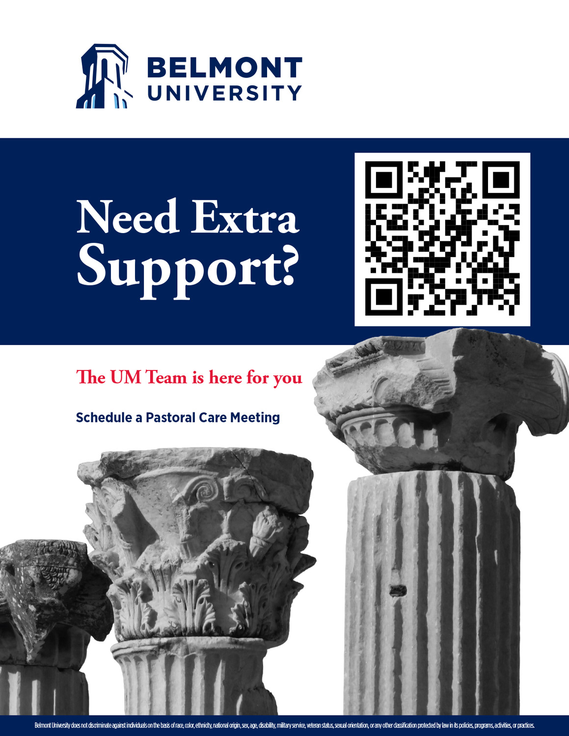
Before landing on the final direction, I developed several alternate concepts. Each one explored a different balance of layout, imagery, and messaging within the same brand system.
The process
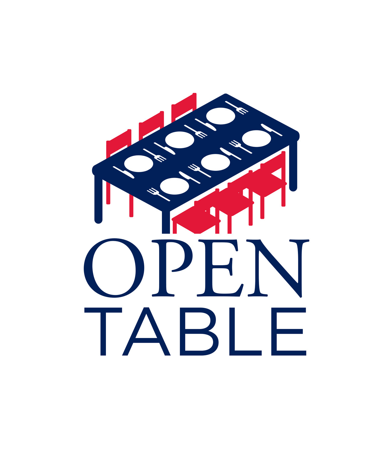
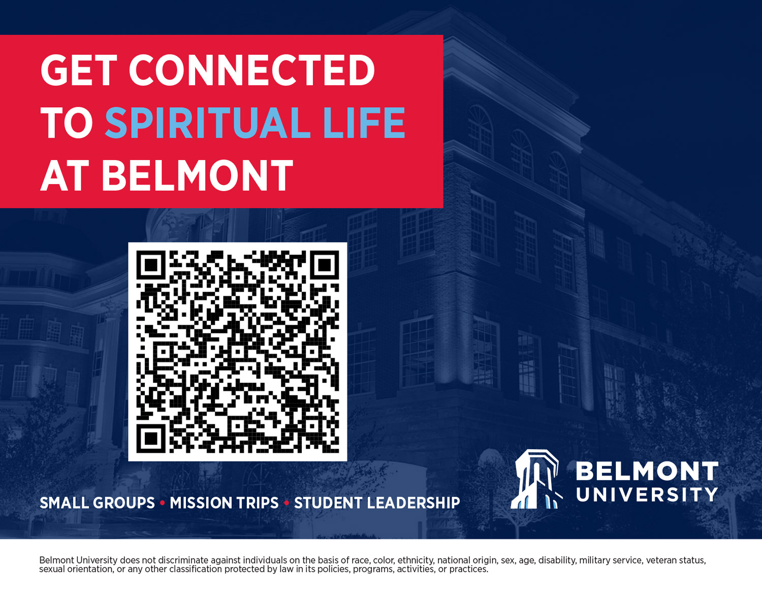
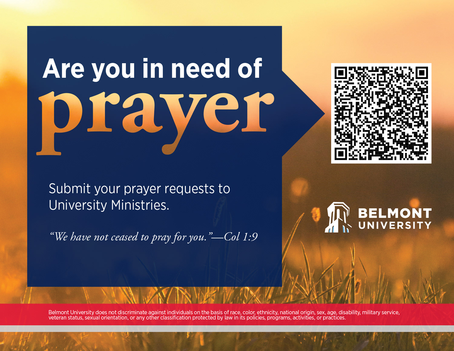
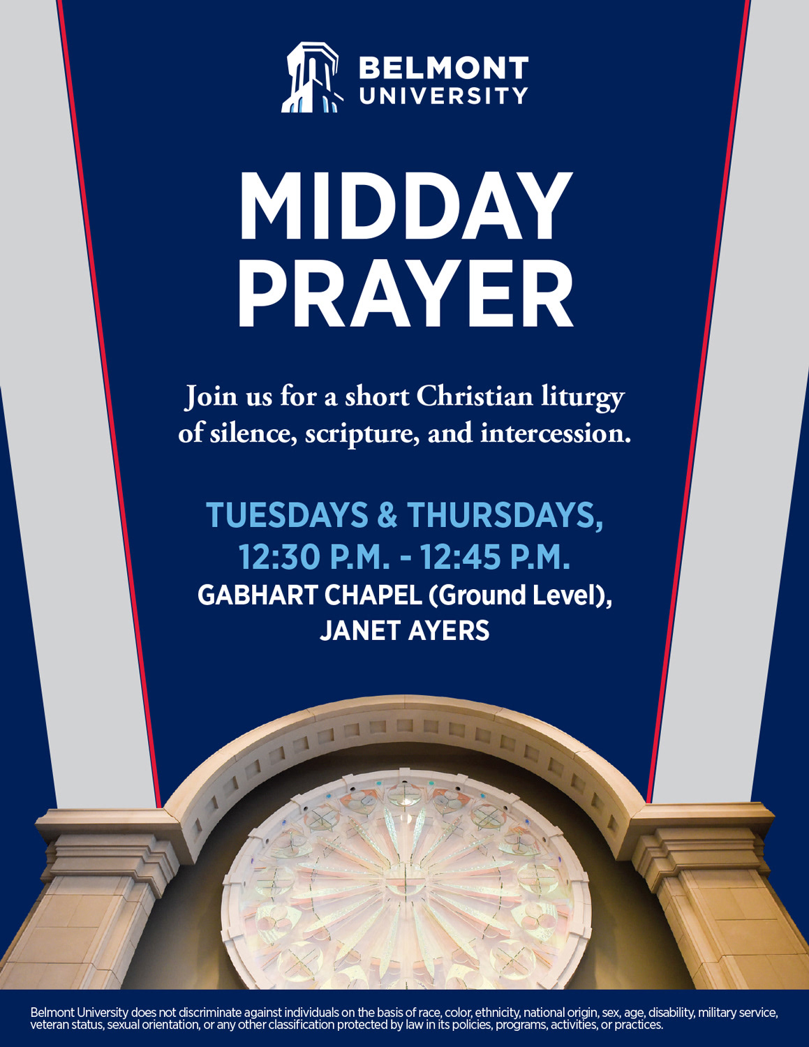
I built every piece from the school's brand guide, using its approved colors and fonts. The school's religious themes shaped the tone and messaging, and recognizable campus locations supplied the imagery wherever a photo was needed. I designed each layout to resize cleanly, so the same concept held up as a poster, a flyer, and a display graphic on screens. I also created an event logo for their Open Table event, emphasizing the dining and free to come nature of the occasion, so the event had its own identity while still feeling part of the school's brand.
The solution
The selected design gave the campus a cohesive, recognizable look across every format, grounded in the school's brand, themes, and setting.