The brief
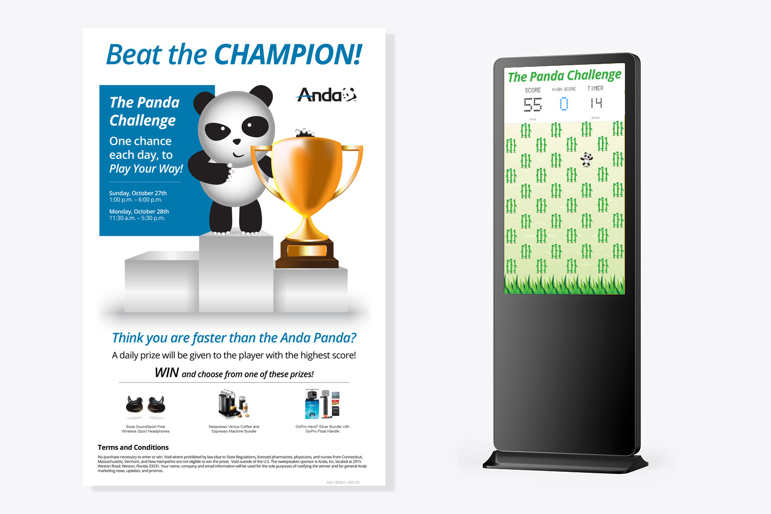
Anda, a national pharmaceutical distributor, needed a visual identity that could scale across a wide range of B2B communications, print and digital alike. The existing branding leaned heavily on common, generic icons and was built on an overly complex grid system, making it difficult to apply consistently across the many formats Anda used to reach over 60,000 retail, hospital, and physician partners.


The process
I moved away from the old icon-heavy approach and built a more flexible system combining abstract icons, custom icons, and photography. This gave the brand multiple visual tools to pull from depending on the medium, rather than forcing every touchpoint through the same rigid grid. I paired this with a deep blue palette and crisp typography. That system carried across a full library of catalogs, brochures, and flyers.



The solution
The result was a cohesive but flexible identity that could adapt to whatever medium a communication called for, without losing visual consistency or brand recognition. The new system gave Anda a stronger, more professional presence across their marketing materials, website, and printed collateral, while solving the rigidity and generic feel of the previous branding.